Optimizing lead forms to reduce friction involves simplifying the form, offering value upfront, using progressive fields, and testing different form designs. By making it easier for users to complete, you can significantly increase form submissions and the overall lead generation process.
Lead forms are a crucial element in converting visitors into qualified leads. However, if they are too complex, lengthy, or unclear, they can become a barrier to conversion. Reducing friction in lead forms is all about making it as easy as possible for potential customers to submit their information, without overwhelming them or causing hesitation.
If your forms aren’t converting as well as they should, it’s time to optimize them. Let’s break down why friction occurs and the steps you can take to improve form submission rates.
1. Simplify Form Fields and Ask Only for Essential Information
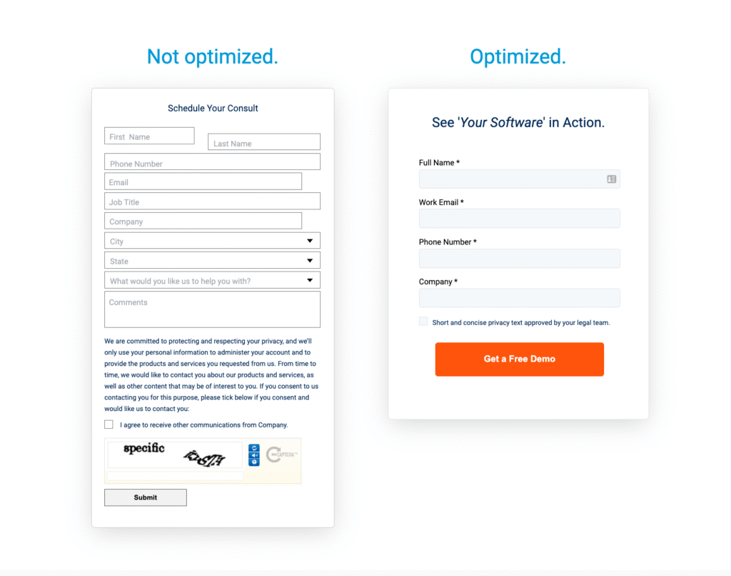
The more fields you ask a user to fill out, the higher the chances they’ll abandon the form. Users are often hesitant to share too much personal information unless they see clear value in return.
Why it happens:
- People don’t like filling out forms with unnecessary details or when they feel their privacy is at risk.
- Lengthy forms create perceived effort, increasing friction.
How to fix:
- Ask for minimal information—start with just the essentials (name, email, phone).
- Use multi-step forms or progressive disclosure to break up the information gathering process.
- Only request additional details once the user is engaged (e.g., in follow-up forms or after they’ve shown strong interest).
2. Offer Immediate Value or Incentive
If you’re asking someone to provide their information, it’s essential to offer something valuable in return. This can be an eBook, a discount, or access to exclusive content. The perceived value should outweigh the effort involved in filling out the form.
Why it happens:
- Without an obvious incentive, users see no reason to complete the form.
How to fix:
- Include a clear CTA that promises immediate value (e.g., “Get your free guide” or “Download now”).
- Highlight value propositions like discounts, educational resources, or exclusive content next to the form
3. Use Auto-fill and Pre-populate Fields
Auto-fill features help reduce friction by automatically filling in some of the details for the user, such as their name or email address. This is particularly useful if you’re asking for information users have already provided in a previous interaction.
Why it happens:
- Requiring users to fill out the same details multiple times is annoying and increases form abandonment rates.
How to fix:
- Enable auto-fill for fields like name, email, or location, especially for returning users.
- Use tools like Google Autofill or CRM integrations to pre-populate fields with previously collected data.
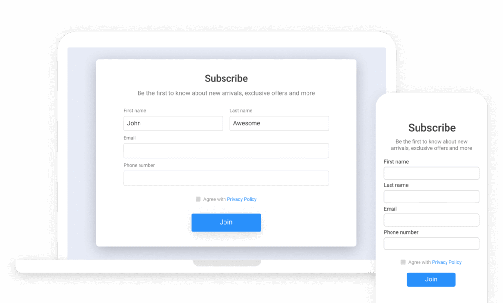
4. Keep Form Design Clean and User-Friendly
A cluttered or poorly designed form can create confusion, making it harder for users to complete the form. Clear design, visible CTAs, and user-friendly layouts encourage more users to take the desired action.
Why it happens:
- If the form is visually overwhelming, users may leave it incomplete or abandon it altogether.
How to fix:
- Reduce clutter by removing unnecessary text or distracting elements around the form.
- Ensure your form is mobile-friendly, as a large percentage of users may fill out forms on mobile devices.
- Group similar fields (e.g., personal information, business information) to make it visually easier for users to digest.
5. Make Buttons and CTAs Clear and Actionable
A call-to-action (CTA) is the most important part of your form, but it’s often overlooked or poorly designed. A vague or generic CTA (e.g., “Submit” or “Click here”) fails to compel users to take action.
Why it happens:
- A weak CTA gives users no reason to click. It feels like an afterthought, not a strong action.
How to fix:
- Make your CTA action-oriented (e.g., “Get Your Free Guide,” “Claim Your Discount,” “Start Your Free Trial”).
- Use contrasting colors to make the CTA button stand out.
- Ensure the CTA is visible above the fold—don’t bury it at the bottom.
6. Test Different Form Lengths and Layouts
What works for one type of form may not work for another. Testing is essential to understanding how your audience responds. A/B testing different form lengths, designs, and layouts can provide valuable insights.
Why it happens:
- No single form design is universally effective. The optimal form setup depends on your specific audience and offer.
How to fix:
- A/B test form variations by changing the number of fields, CTA text, or button colors.
- Track conversion rates for each variation to find the best-performing version.
7. Use Clear Validation Messages for Error Handling
If users make a mistake while filling out the form (e.g., entering an invalid email address), they need to know what went wrong immediately so they can fix it. Long delays or unclear error messages can increase frustration and abandonment rates.
Why it happens:
- Users fill out forms but are unsure where they went wrong or how to fix errors, causing them to give up.
How to fix:
- Implement real-time validation to highlight errors as soon as they happen (e.g., “Please enter a valid email address”).
- Use friendly language for error messages—avoid technical jargon.
- Provide helpful instructions next to form fields if certain inputs are required.
8. Ensure Clear Privacy and Security Assurance
Privacy concerns are at an all-time high, especially when users are providing personal information. Without clear privacy policies or security reassurances, users are likely to hesitate.
Why it happens:
- Without clear assurances, users fear spam or identity theft, leading them to abandon the form.
How to fix:
- Include trust badges such as “Secure Checkout” or “GDPR Compliant.”
- Link to your privacy policy or provide a short message about data protection to reassure users.
- If using payment forms, ensure SSL encryption and clearly indicate the website is secure.
Summary
In lead generation, form optimization plays a crucial role in turning website visitors into qualified leads. By reducing friction through clear design, actionable CTAs, proper segmentation, and effective messaging, you can significantly increase form submissions and drive higher-quality leads.
Here’s a final checklist to optimize lead forms:
- Keep it simple—only ask for essential information.
- Use clear and actionable CTAs that focus on the user’s benefit.
- Ensure mobile optimization and a smooth user experience.
- Test and iterate on form lengths, designs, and CTAs.
- Incorporate trust elements like security badges and privacy policies.
How Socinova Can Help
At Socinova, we specialize in lead generation and conversion optimization. Whether you’re struggling with form design, ad targeting, or automation workflows, we help businesses create efficient lead funnels that capture high-quality prospects and convert them into loyal customers.
Let’s take your lead generation strategy to the next level. Contact us today.